
Power BI dashboards for insurance KPIs provide a unified view of metrics such as loss ratio, claims velocity, claims frequency, claims severity, claims aging, and retention. A governed dashboard connects these KPIs to product, geography, claim type, customer cohort, and channel dimensions so insurers can identify performance changes, understand their drivers, and take action.
The key is not simply visualizing KPIs. Each KPI should have a defined business formula, trusted source data, a target or benchmark where appropriate, and drill-down dimensions that explain performance.
For example:
Loss Ratio → Line of Business → Product → Geography → Claim Type
or:
Retention → Customer Segment → Product → Channel → Renewal Cohort
Power BI is Microsoft’s analytics and visualization workload within Microsoft Fabric, allowing organizations to combine governed semantic models with interactive reports, dashboards, and analytics.
A strong Power BI insurance KPI dashboard should answer three questions:
- Are we financially performing as expected?
- Are claims moving efficiently?
- Are we retaining profitable customers and policies?
The core KPI framework should include:
- Loss ratio
- Claims frequency
- Claims severity
- Claims velocity
- Claims cycle time
- Claims aging
- Open claims
- Retention rate
- Renewal rate
- Cancellation rate
- Earned premium
- Combined ratio
The most effective architecture is:
Insurance Systems → Fabric/Enterprise Data Platform → Governed Semantic Model → Power BI → KPI Dashboard → Drill-Down → Business Action
What Is a Power BI Insurance KPI Dashboard?
A Power BI insurance KPI dashboard is an interactive analytics layer that brings together insurance performance metrics and allows users to monitor trends, compare performance, drill into drivers, and identify exceptions.
Unlike a static report, a well-designed dashboard connects an executive KPI to the underlying operational data.
For example:
Loss ratio increased
should lead to:
Which line of business caused the increase?
Then:
Which geography?
Then:
Which claim types?
Then:
Was the increase caused by frequency, severity, reserve development, or another driver?
Power BI KPI visuals are specifically designed to communicate progress against a measurable target or goal.
This makes Power BI particularly useful for insurance organizations that need both executive visibility and operational investigation.
Read our blog on Power BI Architecture Explained: How the Platform Works in 2026
The 3 Core Insurance KPIs to Build the Dashboard Around
For this dashboard topic, three KPI groups should sit at the center:
1. Loss Ratio
Answers:
How much of our earned premium is being consumed by incurred losses?
2. Claims Velocity
Answers:
How quickly are claims progressing through the claims lifecycle?
3. Retention
Answers:
How effectively are we retaining policies or customers at renewal?
These three perspectives provide a useful combination of:
Financial performance + operational performance + customer performance
1. Loss Ratio Dashboard
A loss ratio dashboard shows the relationship between incurred losses and earned premium and helps insurers identify deterioration or improvement in underwriting performance. The most useful implementation goes beyond the headline percentage by showing loss ratio trends and the business segments driving changes.
The NAIC defines loss ratio as the percentage of incurred losses to earned premiums.
Basic formula
Loss Ratio = Incurred Losses ÷ Earned Premium × 100
However, insurers should use the approved definition applicable to their reporting context.
For example, the NAIC’s private flood data call uses a specific loss-ratio definition incorporating direct losses incurred and defense and cost-containment incurred relative to direct premium earned.
Therefore, the Power BI semantic model should contain a clearly governed definition rather than allowing every report author to create their own calculation.
For organizations exploring broader data strategies, aligning Power BI with a structured data foundation is critical. Techment’s perspective on this is explored in: What Is Power BI Copilot? 5 Enterprise Strategies to Be Ready
What the Loss Ratio Dashboard Should Show
Executive KPI cards
- Current loss ratio
- Prior-period loss ratio
- Year-over-year change
- Target loss ratio
- Variance to target
Trend analysis
- Monthly loss ratio
- Quarterly loss ratio
- Year-over-year trend
- Rolling 12-month loss ratio
Driver analysis
- Loss ratio by line of business
- Loss ratio by product
- Loss ratio by geography
- Loss ratio by claim type
- Loss ratio by coverage
- Loss ratio by distribution channel
- Loss ratio by underwriting cohort
Recommended dashboard flow
Loss Ratio
     ↓
Trend
     ↓
Line of Business
     ↓
Product
     ↓
Geography
     ↓
Claim Type
     ↓
Frequency + Severity
This turns the KPI from a reporting metric into a diagnostic tool.
Loss Ratio Should Not Be Viewed Alone
A change in loss ratio does not explain its own cause.
A Power BI dashboard should connect:
Loss Ratio + Frequency + Severity + Premium + Exposure
For example:
| Scenario | Frequency | Severity | Likely Interpretation |
|---|---|---|---|
| A | ↑ | → | More claims |
| B | → | ↑ | More expensive claims |
| C | ↑ | ↑ | Broad deterioration |
| D | ↓ | ↑ | Fewer but more severe claims |
| E | ↓ | ↓ | Improving loss experience |
The NAIC defines loss frequency as the incidence of claims on a policy during a premium period and provides specific frequency and severity calculations for certain reporting contexts.
This is why a dashboard should allow users to move from loss ratio to its underlying drivers.
2. Claims Velocity Dashboard
Claims velocity measures how quickly claims move through defined stages of the claims process. Instead of relying on one average claims cycle-time number, a Power BI dashboard should show the time between major claim events and identify where claims are slowing down.
A typical claims journey can be represented as:
FNOL
  ↓
Assignment
  ↓
Investigation
  ↓
Assessment
  ↓
Coverage Decision
  ↓
Payment
  ↓
Closure
The dashboard should measure elapsed time between these stages.
Claims Velocity KPIs
Track:
- Average claim cycle time
- Median claim cycle time
- 75th percentile cycle time
- 90th percentile cycle time
- FNOL-to-assignment time
- Assignment-to-inspection time
- Inspection-to-decision time
- Decision-to-payment time
- Payment-to-closure time
- SLA breach rate
- Open claims
- Claims aging
Why median matters
Average cycle time can be distorted by a small number of very complex claims.
For example:
Average = 12 days
does not tell the same story as:
Median = 5 days
90th percentile = 31 days
The second view shows that most claims move quickly while a long tail remains unresolved.
Claims Velocity Dashboard Design
A useful dashboard should combine four views.
1. Lifecycle view
Show time spent at every claim stage.
2. Trend view
Show whether claims are getting faster or slower.
3. Aging view
Show how many open claims are:
- 0–7 days
- 8–14 days
- 15–30 days
- 31–60 days
- 61–90 days
- 90+ days
4. Exception view
Highlight:
- SLA breaches
- Long-running claims
- Bottleneck stages
- High-value claims awaiting action
- Regions or teams with deteriorating cycle time
Claims Velocity: The Questions Power BI Should Answer
The dashboard should make these questions easy to answer:
- Where are claims getting stuck?
- Which claim types take longest?
- Which regions have the slowest cycle times?
- Which stages create the largest delay?
- Are simple claims being processed faster?
- Which claims exceed SLA?
- Is the backlog increasing?
- Is claims velocity improving month over month?
- Are delays concentrated among specific teams or workflows?
The objective is not to report:
Average claims cycle time = 8.4 days
The objective is to identify:
Inspection-to-decision time increased 24% in commercial property claims in three regions.
That is actionable intelligence.
3. Insurance Retention Dashboard
An insurance retention dashboard measures how effectively an insurer retains customers or policies through renewal and cancellation cycles. The dashboard should segment retention by product, customer cohort, channel, geography, tenure, premium, and claims experience rather than reporting one enterprise-wide percentage.
Retention should be clearly distinguished from related metrics such as renewal and cancellation.
Common measures
Retention Rate
Retained policies or customers ÷ eligible policies or customers
Renewal Rate
Renewed policies ÷ renewal-eligible policies
Cancellation Rate
Cancelled policies ÷ relevant policy population
The denominator and eligibility rules should be explicitly defined in the semantic model.
What the Retention Dashboard Should Show
Executive KPIs
- Retention rate
- Renewal rate
- Cancellation rate
- Lost customers
- New customers
- Retained premium
Cohort analysis
Analyze retention by:
- Policy tenure
- Customer tenure
- Product
- Line of business
- Geography
- Distribution channel
- Broker
- Premium band
- Customer segment
- Claims history
Trend analysis
Show:
- Monthly retention
- Quarterly retention
- Annual renewal rate
- Cohort retention
- Retention versus prior year
- Retention versus target
Why Retention Must Be Segmented
An enterprise retention rate can hide significant portfolio deterioration.
For example:
Overall Retention
       ↓
Product
       ↓
Customer Segment
       ↓
Tenure
       ↓
Renewal Cohort
       ↓
Premium Change
       ↓
Claims Experience
A useful dashboard may reveal:
Overall retention is stable, but retention among newer customers in one product category has declined significantly.
That insight can lead to investigation of:
- Pricing changes
- Claims experience
- Customer service
- Renewal communication
- Product competitiveness
- Distribution performance
The Insurance KPI Dashboard: Recommended Layout
A practical executive dashboard can use five sections.
┌──────────────────────────────────────────────────────────┐
│ LOSS RATIO | CLAIMS VELOCITY | RETENTION | PREMIUM      │
├──────────────────────────────────────────────────────────┤
│                                                          │
│              KPI TREND / TARGET ANALYSIS                 │
│                                                          │
├────────────────────────┬─────────────────────────────────┤
│ Loss Ratio Drivers     │ Retention Drivers               │
│ LOB / Product / Region │ Product / Channel / Cohort      │
├────────────────────────┼─────────────────────────────────┤
│ Claims Velocity        │ Claims Aging                    │
│ Lifecycle Performance  │ Open Claims / SLA Breaches      │
├────────────────────────┴─────────────────────────────────┤
│              Detailed Drill-Through                      │
└──────────────────────────────────────────────────────────┘
The first screen should answer:
What changed?
The next layer should answer:
Why did it change?
The final layer should answer:
Where should we act?
The Insurance KPI Semantic Model
The dashboard is only as reliable as the semantic model behind it.
A practical insurance model can contain:
Fact tables
- Fact Claims
- Fact Claim Transactions
- Fact Premium
- Fact Policies
- Fact Renewals
- Fact Payments
Dimensions
- Date
- Customer
- Policy
- Product
- Coverage
- Geography
- Claim Type
- Distribution Channel
- Adjuster
Conceptually:
                  Dim Date
                     │
                     ▼
Dim Customer → Fact Claims ← Dim Policy
                     │
              ┌──────┼──────┐
              ▼      ▼      ▼
          Product  Geography Coverage
                     │
                     ▼
                  Adjuster
The objective is to ensure that loss ratio, claims velocity, and retention calculations are based on consistent relationships and business definitions.
Why the Semantic Model Matters
Without a governed semantic model, different teams may calculate the same KPI differently.
For example:
Dashboard A
Loss Ratio = Paid Losses / Written Premium
Dashboard B
Loss Ratio = Incurred Losses / Earned Premium
Both may be technically valid for different analytical purposes, but they are not interchangeable.
The dashboard therefore needs:
- KPI definitions
- Approved measures
- Clear numerator and denominator
- Data ownership
- Data lineage
- Time definitions
- Refresh rules
- Business glossary
Microsoft positions semantic models as the business-semantic layer used with Power BI and Fabric analytics.
Microsoft Fabric + Power BI for Insurance KPI Dashboards
For enterprises already using Microsoft technologies, Microsoft Fabric can provide the data foundation while Power BI provides the analytical and visualization layer.
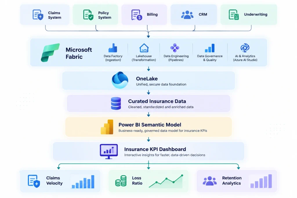
Microsoft describes Power BI as a core component of Fabric and supports combining Power BI with Fabric data and semantic capabilities for governed analytics.
Power BI Measures for Core Insurance KPIs
The following are illustrative DAX measures. Production definitions should be aligned with the insurer’s approved actuarial, finance, regulatory, and operational definitions.
Loss Ratio
Loss Ratio =
DIVIDE(
    [Incurred Losses],
    [Earned Premium],
    0
)
Claims Frequency
Claims Frequency =
DIVIDE(
    [Claim Count],
    [Exposure],
    0
)
Claims Severity
Claims Severity =
DIVIDE(
    [Incurred Losses],
    [Claim Count],
    0
)
Retention Rate
Retention Rate =
DIVIDE(
    [Retained Policies],
    [Renewal Eligible Policies],
    0
)
Average Claim Cycle Time
Average Claim Cycle Days =
AVERAGEX(
    Claims,
    DATEDIFF(
        Claims[FNOLDate],
        Claims[ClosureDate],
        DAY
    )
)
The critical implementation principle is to centralize these measures rather than recreating them independently in every report.
Read our blog on Microsoft Fabric for Insurance Carriers: A Reference Architecture
How to Make the Dashboard Actionable
Every KPI should have an associated decision.
| KPI Signal | Diagnostic Question | Business Response |
|---|---|---|
| Loss ratio ↑ | Which portfolio drove the change? | Underwriting review |
| Frequency ↑ | Are claims occurring more often? | Investigate exposure/portfolio |
| Severity ↑ | Which claim types increased cost? | Claims/actuarial review |
| Velocity ↓ | Where is the process slowing? | Workflow intervention |
| Aging ↑ | Which claims exceed SLA? | Claims escalation |
| Retention ↓ | Which customer cohorts are leaving? | Renewal intervention |
| Cancellation ↑ | What changed before cancellation? | Customer journey analysis |
This creates the chain:
KPI → Diagnosis → Action
rather than:
KPI → Screenshot → Monthly meeting
Power BI Alerts for Insurance KPI Monitoring
Dashboards become more useful when critical KPI changes can trigger alerts.
Potential alert conditions include:
- Loss ratio exceeds threshold
- Claims backlog exceeds target
- Claims velocity falls below SLA
- 90+ day claims increase
- Retention falls below target
- Cancellation rate increases
- Product-level performance deteriorates
Power BI currently supports report alerts through Fabric Activator in preview for applicable Fabric capacity scenarios.
For production implementations, alerting should be tied to clearly defined thresholds and an accountable business response.
Common Mistakes in Insurance Power BI KPI Dashboards
1. Starting With Charts
Building visuals before defining KPIs creates inconsistent metrics.
Better: Define the KPI contract first.
2. Showing Only the Enterprise Average
An overall loss ratio or retention rate hides portfolio differences.
Better: Enable product, geography, cohort, and claim-level drill-down.
3. Using Average Claims Cycle Time Alone
Averages hide long-running claims.
Better: Add median, percentiles, aging, and SLA breach rates.
4. Mixing Paid and Incurred Definitions
This can produce misleading loss-ratio comparisons.
Better: Clearly define numerator, denominator, and reporting basis.
5. Treating Retention as One Number
Retention varies by cohort and product.
Better: Segment by tenure, product, channel, geography, and renewal cohort.
6. Building Independent Semantic Logic
Multiple dashboards eventually create conflicting KPI definitions.
Better: Use governed shared measures.
7. Ignoring Data Freshness
Claims operations may need frequent updates while executive reporting may not.
Better: Match refresh frequency to the decision.
8. Designing Dashboards Without a Business Action
A KPI without an action path becomes passive reporting.
Better: Connect exceptions to an owner and workflow.
Insurance Power BI Dashboard Implementation Roadmap
Phase 1: Define
Document:
- Business questions
- KPI definitions
- KPI owners
- Targets
- Dimensions
- Reporting frequency
Phase 2: Integrate
Connect:
- Claims
- Policy
- Premium
- Customer
- Billing
- Renewal
Phase 3: Model
Build:
- Insurance star schema
- Semantic model
- Measures
- Time dimensions
- Security
Phase 4: Build MVP
Start with:
- Loss ratio
- Claims velocity
- Claims aging
- Retention
- Frequency
- Severity
Phase 5: Add Drill-Down
Enable analysis by:
- Product
- Geography
- Claim type
- Customer segment
- Channel
- Cohort
Phase 6: Operationalize
Add:
- Alerts
- Exception reporting
- Workflow integration
- Role-specific dashboards
Phase 7: Govern
Monitor:
- KPI accuracy
- Data quality
- Refresh performance
- Dashboard usage
- Business outcomes
How AI Can Extend Insurance KPI Dashboards
Once the underlying KPI model is governed, AI can make dashboard analysis more conversational.
Instead of manually navigating:
Loss Ratio → Product → Region → Claim Type
a user could ask:
“Why did loss ratio increase this quarter?”
or:
“Which products have both worsening loss ratios and declining retention?”
or:
“Which claims are driving the increase in average cycle time?”
The AI layer should operate over governed semantic definitions rather than inventing KPI calculations.
Microsoft’s Fabric platform combines Power BI with semantic and analytics capabilities designed to help users explore and act on business data.
This creates a potential progression:
Dashboard → Natural-language analytics → AI-assisted diagnosis → Workflow action
Read our blog on RAG for Insurance: How Retrieval-Augmented AI Speeds Up Claims Processing
Key Takeaways
- Power BI dashboards for insurance KPIs should connect financial, claims, and customer performance.
- Loss ratio should be analyzed alongside frequency and severity.
- Claims velocity should expose delays across the claims lifecycle.
- Claims aging should complement average cycle time.
- Retention should be analyzed by product, cohort, channel, tenure, and geography.
- KPI definitions must be standardized before dashboards are built.
- A governed semantic model prevents competing versions of loss ratio, retention, and claims metrics.
- Microsoft Fabric can provide the data foundation while Power BI provides visualization and analytical experiences.
- The best dashboard follows KPI → Trend → Driver → Exception → Action.
- Dashboard quality depends as much on data modeling and governance as visualization.
- AI can extend governed KPI dashboards into natural-language investigation and decision support.
Conclusion
Power BI dashboards for insurance KPIs are most valuable when they turn insurance data into a repeatable decision process.
Loss ratio provides the financial view of claims performance relative to earned premium. Claims velocity shows whether the claims organization is processing losses efficiently. Retention reveals whether customers and policies are staying with the insurer.
The real value comes from connecting them.
A loss ratio increase becomes more meaningful when the dashboard identifies whether frequency or severity is driving it. A deterioration in claims velocity becomes actionable when Power BI identifies the exact stage where claims are slowing. A retention decline becomes useful when the dashboard reveals which customer cohorts, products, or channels are responsible.
The architecture should therefore follow:
Insurance Data → Governed Semantic Model → Power BI KPI Dashboard → Drill-Down → Root Cause → Business Action
For enterprise insurers, Microsoft Fabric can provide the broader data and analytics foundation, while Power BI delivers the governed visualization and interactive analysis layer.
The goal is not to build another collection of insurance charts.
It is to create a trusted KPI decision layer for claims, underwriting, finance, and customer teams.
Techment can help insurers build this foundation across Microsoft Fabric, data engineering, Power BI, enterprise analytics, AI, and insurance modernization, connecting fragmented insurance data to governed KPIs and actionable business intelligence.
Frequently Akse Questions
1. What KPIs should an insurance Power BI dashboard include?
The core KPIs should include loss ratio, claims frequency, claims severity, claims velocity, claims cycle time, claims aging, open claims, retention rate, renewal rate, cancellation rate, earned premium, and combined ratio.
2. How is loss ratio calculated in Power BI?
A common insurance calculation is incurred losses divided by earned premium. The exact calculation should follow the insurer’s approved business, actuarial, financial, or regulatory definition. NAIC defines loss ratio as the percentage of incurred losses to earned premiums.
3. What is claims velocity?
Claims velocity measures how quickly claims move through defined stages such as FNOL, assignment, investigation, assessment, decision, payment, and closure.
4. How should claims velocity be measured?
Use multiple measures including average and median cycle time, percentiles, stage-level duration, SLA breaches, and claims aging. This provides more insight than a single average.
5. How do you measure insurance retention?
Retention is typically measured as retained policies or customers divided by the appropriate renewal-eligible population. The denominator and eligibility rules should be explicitly defined.
6. Is Microsoft Fabric useful for Power BI insurance dashboards?
Yes. Microsoft Fabric integrates Power BI with broader data and analytics capabilities, providing a potential foundation for centralized insurance data, semantic models, reporting, and analytics.
7. What is the best data model for an insurance Power BI dashboard?
A governed dimensional or star-schema model is a strong starting point, with claims, premium, policy, and renewal facts connected to dimensions such as date, product, customer, geography, coverage, and claim type.